top of page
Pasta Amoré
Pasta Amoré menu cover - an assortment of vegetables and pasta on a wooden cutting board with the company logo in the middle of the page
A slate stone background with photos of select menu items and the starters, salads, and soups listed
A slate stone background with a close up image of the Shrimp Scampi and all pasta entrees listed
A close up of the Nona's Favorite pizza with all of the pizza offerings listed
A gradient of gelato flavors in cones with all of the dessert offerings listed
The back cover of the Pasta Amoré menu - an assortment of vegetables and pasta on a wooden cutting board with the company logo in the middle and the social media icons at the bottom of the page
A mockup of the Pasta Amoré menu - a woman holding the menu open and reading it
The Pasta Amoré tri-fold brochure for carry-out orders - a slate gray background with the Starters, Salads, Soups, and Pizza sections listed and various menu offerings pictured
The Pasta Amoré tri-fold brochure for carry-out orders - a slate gray background with the Pasta options listed and a close up of the Shrimp Scampi and Nona's Favorite pizza pictured
Mockup of the tri-fold carry-out brochure - both pages of the brochure clipped to a wooden cutting board

Menu Design

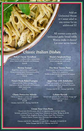
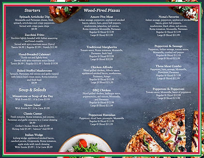
Pasta Amoré was looking for a re-branding that would attract new clientele as well as set them apart from their competitors. They are a casual Italian restaurant focused on family style dining and a family friendly atmosphere.

Project Info

Client: Pasta Amoré

Category: Food & beverage brand identity

Role: Lead Designer

Project behind the scenes:

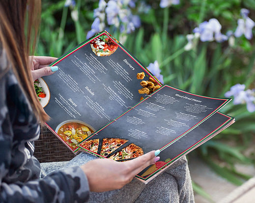
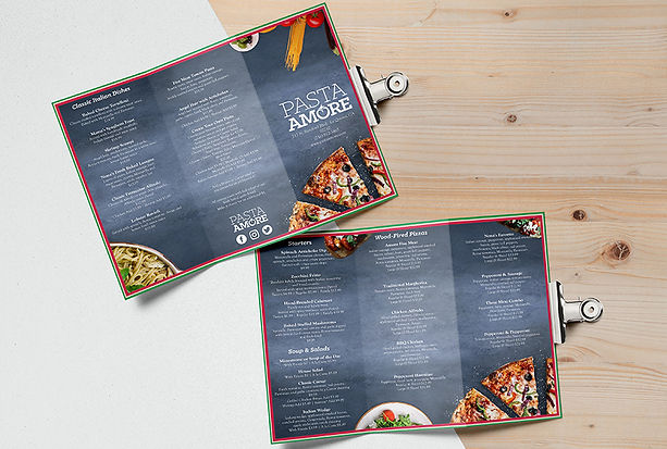
In doing research on their competitors I opted to take the re-branding in a completely different direction from their counterparts. I used darker wood grain and stone backgrounds to give the menu a more rustic and Old World feeling to reflect their classic Italian cuisine. When discussing their current clientele I learned that Pasta Amoré was mostly a family oriented restaurant but they were looking to reach other demographics. I created the menu design to elevate the business’ aesthetics in order to attract couples looking for a date night location, major business meetings, and large parties for a celebration space. I carried the same aesthetic as the main menu over to their carryout brochure. This creates a cohesive brand identity and furthers the restaurants reach in attracting various demographics by promoting their brand in a hand held form.

  • Instagram
  • LinkedIn
  • Behance

© 2023 by Adam Speck Studios.

bottom of page